|
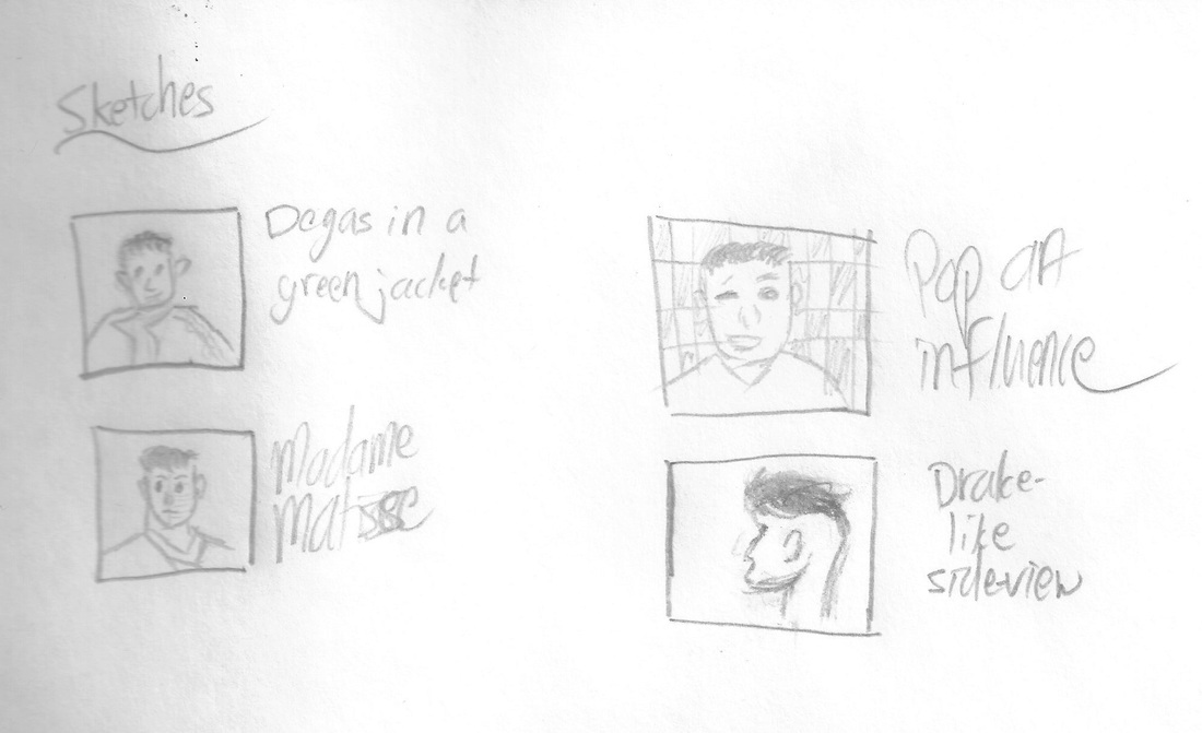
Green Jacket
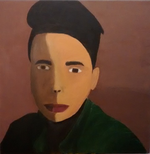
Self-Portrait 91.4 cm x 91.4 cm December 2015 Inspired by Edgar Degas' "Degas in a Green Jacket, and Henri Matisse’s “Portrait of Madame Matisse, I used important features from the two to create my self-portrait. I took a self-shot photo of my head and used it as the base. With the outline of my face on the canvas, I painted the two contrasting sides, and the green jacket.
|
|
Inspiration
Self-portraits are a type of project I don't have a lot of experience with. So when I started this, I was scared yet excited for what was coming. I knew I was going to experience many obstacles, but I was able to overcome them with hard work and experimentation. While looking for inspiration, I did not sketch, but I did go through and look at the self-portraits painted by painters I had studied who were from previous time eras. I knew I wanted something simple, so I was going to choose between Edgar Degas and Pierre-Auguste Renoir. After careful evaluation of their pieces, I went with Degas's "Degas in a Green Jacket" because it wasn't complex and his painting style is similar to what I want to try. When I revisited my self portrait, I decided to add in a little bit of Matisse's work and more specifically "Madame Matisse." |
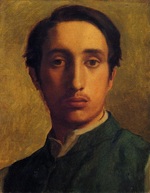
Edgar Degas, "Degas in a Green Jacket," 1856
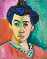
Henri Matisse, "Portrait of Madame Matisse," 1905
|
|
Process
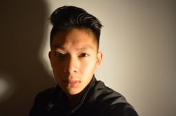
To start off, I took a picture of myself using a tripod and a camera. I posed the same way as in the painting, and tried to get the lighting to be similar. Getting the light values to be similar was hard since I was only using a desk lamp. The jacket I am wearing is black, but I didn't worry about that too much because I could just paint it green in my piece. For the first time I stretched out my first canvas. Using 91.4 cm (three feet) by 91.4 cm (three feet) wood panels, I made a square and wrapped canvas around it. I stuck them in place with staples and put gesso on the canvas. Once the gesso dried I laid down a tan base color, similar to Degas's but lighter, so that I would not have any white spaces. Then I printed the photograph that I had taken and put a grid on it. I also put a grid on the canvas, so I could draw myself onto there. I didn't have a ruler 3 feet long, so I used 3 rulers instead, which worked out even if the lines were a bit crooked. |
|
From there, I started with the jacket. Using acrylic paints, I bought from my local art store, I made swatches of dark green. I put the green I liked down and added white to wherever I was going to blend. It took a while, but I got the shading to how I wanted it to be. It was actually better than I had planned it to be. Then I painted in my hair, which was a basic black paint, with a few streaks of white to show the light reflections. Then my eyes, which was painted with a dark brown. Finally, I began to paint the face.
Starting from right to left, I created a flesh tone similar to the color of my arm. I primarily used the colors yellow, red, and blue. I added some brown to where the face was supposed to be darker and some white to where it was supposed to be lighter. When I finished the right side of my face, I went to the left side. This color was difficult for me to get because I couldn't use black, otherwise it would turn into an ugly green color. So I tried brown, and that was a success. I laid down that color and blended the two colors down the middle. The photograph I had taken does not show the blending values, but I wanted to do it because it looked better and my swatches weren't the best. I shaded the area around the nose, and uses black fro the nostrils. Then I began the lips. Using red, white, and a bit of brown, I painted my lips a dark red color. I drew my eyebrows, which weren't that hard. I just used lot of medium sized strokes above my eye. Lastly I repainted the background so that the shading would look nicer and it covers the grid lines. |
|
Reflection
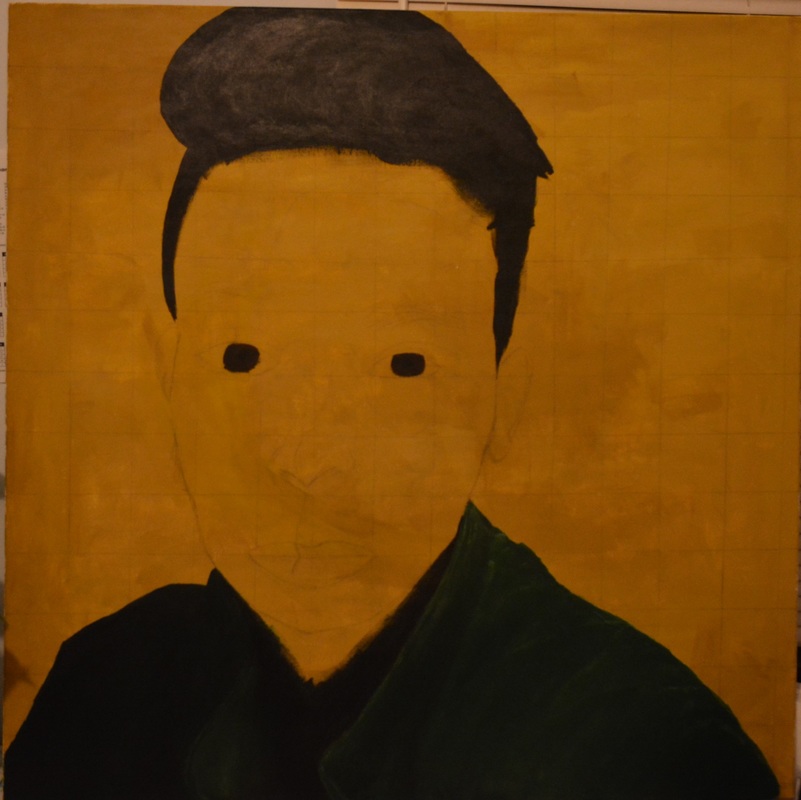
After finishing, I saw that I had done an okay job. The blending on the jacket was well done and I find that to be the best part. The worst part would be the flesh tones on he face. I had lots of trouble with creating an accurate color and had to do a lot of experimenting. The face color was a bit too yellow, and there wasn't too much shading involved on the face. The lip color was also a bit too dark and too red. If I were to redo this, I would spend a lot more time on creating the flesh tone, and try to be more prominent with the shading on the face.
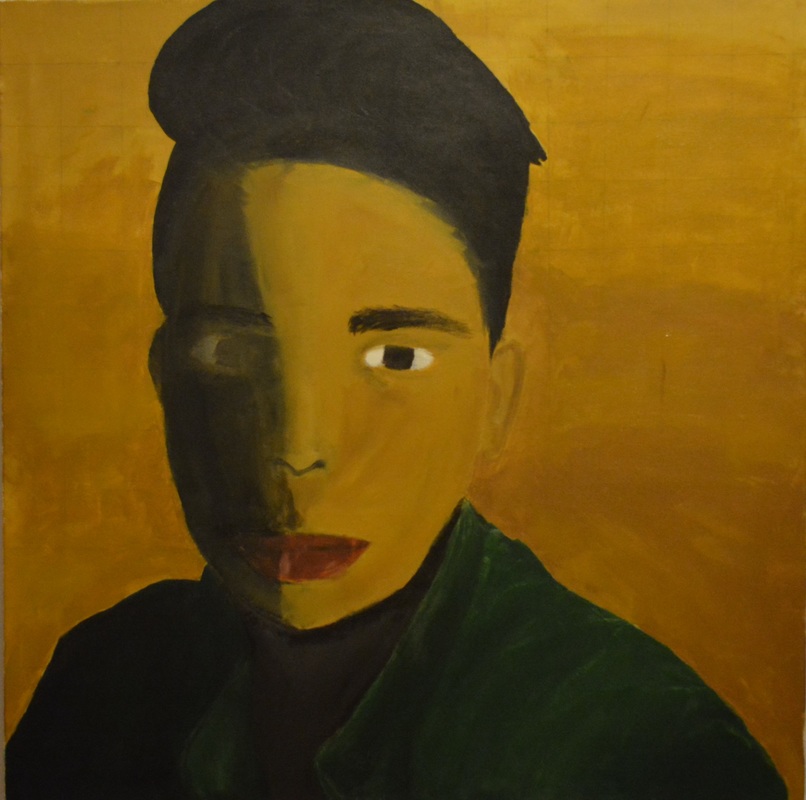
I went back to this piece and created all new skin tones. I used the same colors, but more of the yellow and red. I mixed those two first, and then some blue. It created a mocha like color, and I was able to add white and more yellow to get the skin tone I wanted. I repainted the whole face that color and blended. The picture doesn't show the shading, but it is present. Through this, I also wanted to make my piece look a bit more like "Madame Matisse" by adding a yellow hue down the middle of my face, and made the different sides of my face more contrasting.
|
|
The painting on the right was the original piece, and the one on the left is the result of the rework. |

- "Degas in a Green Jacket." The Athenaeum. Web. Dec. 2015. <http://www.the-athenaeum.org/art/full.php?ID=4731>.
- "Portrait of Madaem Matisse" Statens Museum for Kunst. Web. Feburary-May 2016. <http://www.smk.dk/en/explore-the-art/highlights/henri-matisse-portrait-of-madame-matisse-the-green-line/>
